Salutations Space Cadets!
I was just talking to a friend earlier today that I was meaning to do this blog post for a while and kept putting it off, but since I’ve been a bit scattered-brained and distracted working on the current new page (It’s coming! I’m on the colours) I’ve decided, typically in the late evening, to discuss the design process between our latest characters in the series – Cheri and Cola!
These girls finally recently got added to the cast page, along with their boss Jagen, which Wave wrote for those of you who have yet to see it here it is below:
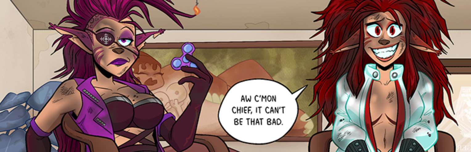
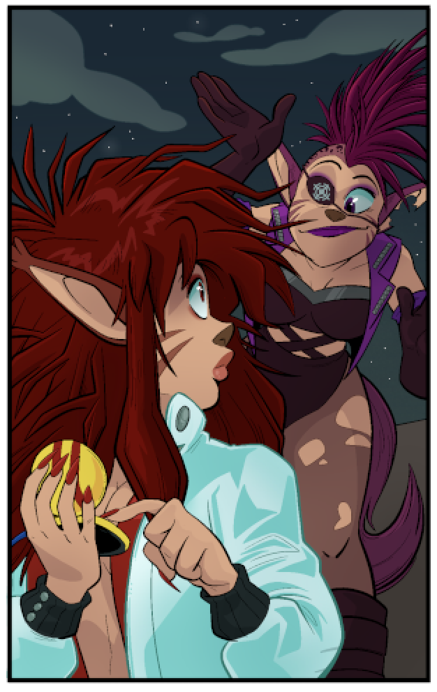
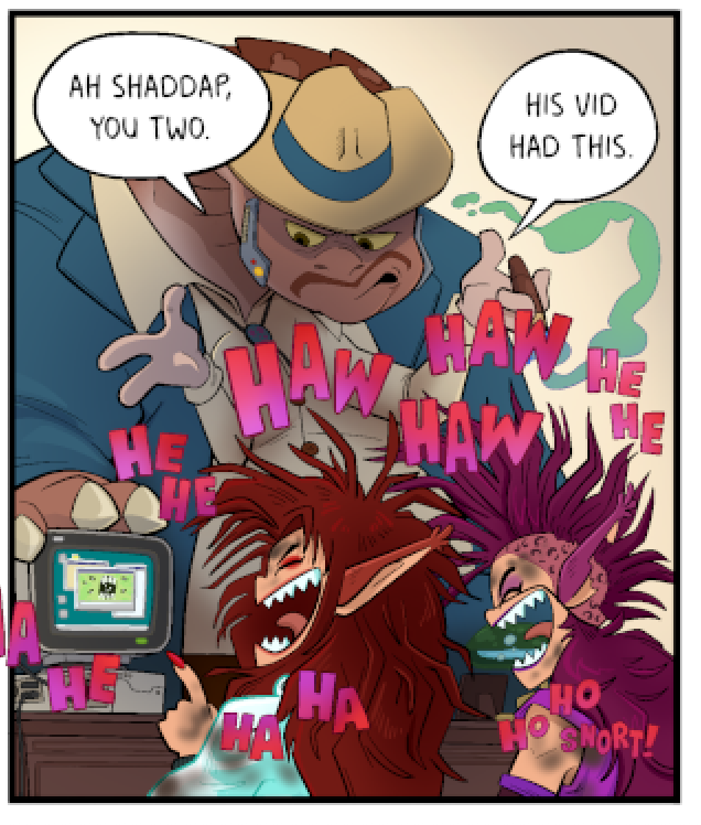
The troublemakers of GHC’s 4th Division that are the cause of Jagen’s stress-induced headaches on a weekly basis. Cheri (that’s the one with the red hair) is the more rational of the duo and often the one coming up with plans and reining in her sister, Cola. Cola (the one with the eyepatch) is much more brash and impulsive, never one to turn down making a situation worse if it means getting to use a giant gun or a high explosive. Between the two of them, they make one quasi-functional person, which is great considering they are constantly one step away from getting canned from the GHC.
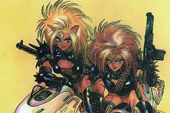
C&C’s initial conception actually came from a relatively humble place, I had come across this image of the Puma Sisters from the manga Dominion by Masamune Shirow, and with The Space Between being partially inspired by 80’s-00’s anime, I walked (virutally) straight up to Wave and demanded that we have 80’s inspired anime cat girls with guns in our comic. And thus, Cheri and Cola were born.
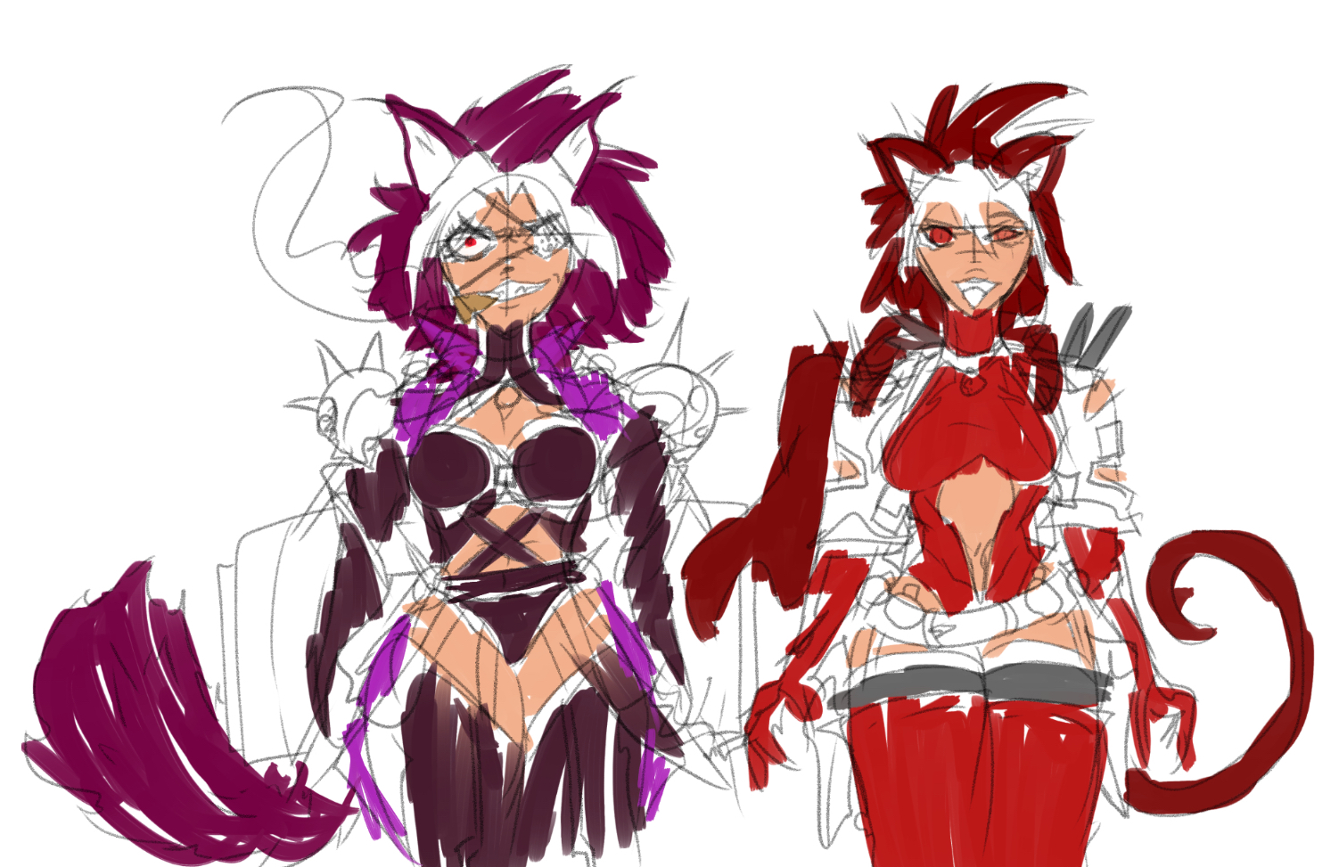
Wave was the first to draw up concept art for the duo, and they sat about for at least a year while we were working away on chapter 3 – Though Wave and my own style is quite different you can definitely still see the design elements that remained consistent, particularly the colour palettes and Cola’s eyepatch.
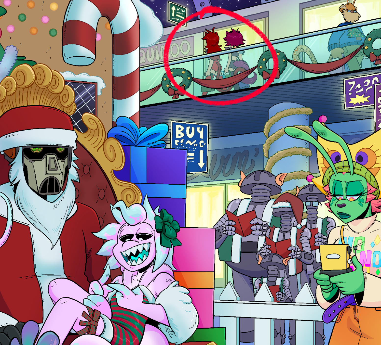
I developed and finalised their designs once Chapter 3 was wrapped up, but they actually first ‘officially’ featured in our 2025 Christmas illustration if you look closely (One day I will have a gallery section on this website for stuff like this). Below are a collection of drawings which built up to the look Cheri and Cola currently have today.
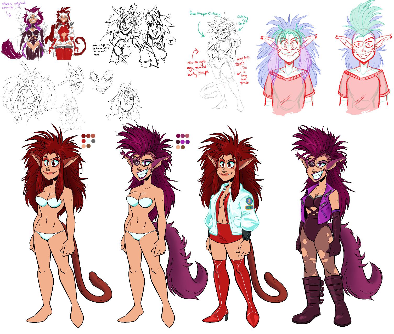
There hair was a very important part of the design for me, I tried my best to get some of that 80’s glam rock / punk inspiration into their looks and moved away from traditional cat ears. They’re characters that I want to be able to be silly and stupid with with their expressions, manga-inspired, I suppose. As with all designs throughout the series, and with the nature of webcomics being in full swing, you probably will see changes as the comic continues and grows. This naturally happens when you get more comfortable drawing a character, or decide you prefer to do something a slightly different way.
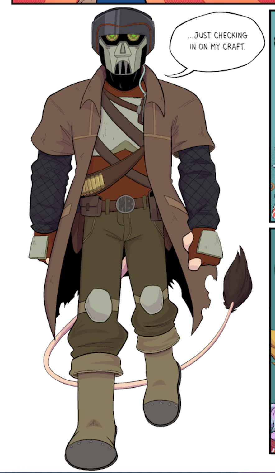
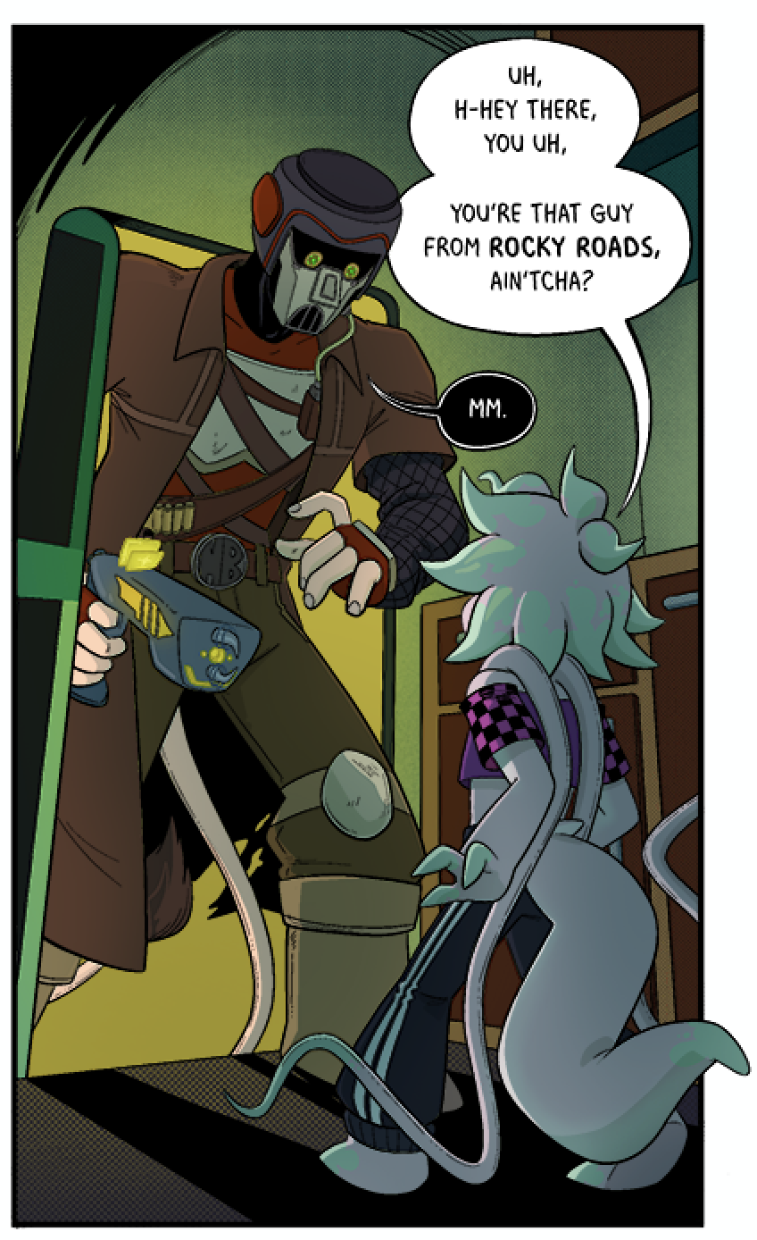
Keep in mind that a chapter can take me around a year to complete. Ferelith and Vexen grew much more pronounced snouts / noses throughout the duration of chapter 1, and just look at the difference from MB’s debut in chapter 2 to chapter 3, I even decided to change how his speech balloons looked, because our boy is dramatic.
When Wave and I create characters together, it is very much a joint effort went it comes to the designing, personality and their roles in the story. Wave has a fantastic ability to bring our character’s to life in the script though, which I am more hands off with except maybe the occasional line of dialogue or suggestion here and there. People often kindly compliment us on the artwork of The Space Between, but the artwork wouldn’t mean shit if it wasn’t supported by such a strong script as its back-bone.
Wave’s Thoughts on the writing / development of Cheri and Cola:
Ah, the girls. Cheri and Cola were conceived of in the vein of 80’s-90’s anime catgirls, mean and dumb and extremely violent, and while they’re definitely antagonistic forces tot he story, they aren’t “evil”. Just rude and rowdy. We needed to have bounty hunters that were more characters than MB, playful and fitting to the overall lighter tone as opposed to MB’s menacing aura. Both were designed in the same sitting, and initially had more of a leather and latex and straps look to them. These designs were then adjusted to make them less of a ballache to draw over and over again.
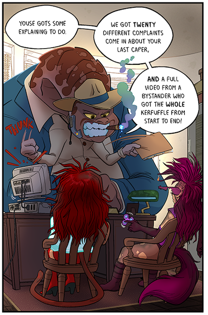
Of course C&C weren’t the only characters to make their debut in chapter 4, their exasperated ringleader, Jagen Jagerson, was a completely different beast all together. Pun probably intended.
The curmudgeonly, cigar-chomping Chief Officer of the Galactic Huntsman Coalition’s 4th District. It’s tough going from field work to administration, but Jagen has done the best he can to whip his district into shape and make the GHC a more respectable organization. This is made more difficult when your underlings are constantly blowing things up. In spite of this, Jagen believes that with enough time, care, and verbal beratement, he can turn even his worst agents into upstanding bounty hunters. Maybe.
I’d say Jagen’s definitely Wave’s giant dinosaur baby. A personality that came out strongly first before a look was given to him. Though again, just like the girls, Wave was at the forefront of what Jagen would become. A lot of my designs for aliens are still very humanoid, so it was nice to get a truly alien looking cast member, he may not be as prominent but he definitely makes the most of his appearances.
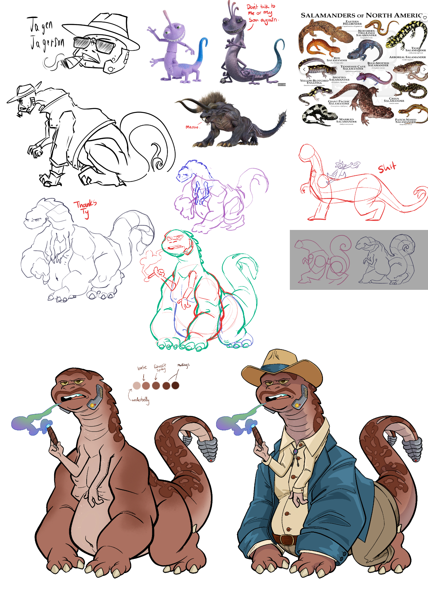
Our friend Ty of Rising Sand helped me work out how to “3D-space” him (i’m sure there’s an actual word for that but we know I’m an idiot). Jagen design phase was considerably more condensed than the girls so I have a much neater document which also shows some of the design inspirations.
Wave’s Thoughts on the writing / development of Jagen:
Jagen went through a few iterations as we tried to figure out the ~vibe~ for him. At first he was thought of as more of a 1920’s New York hardboiled PI type, but when it came time to actually design him, he ended up turning into more of a Chief Who Is Too Old For This Shit type. Been around the block, hard but fair, a heart of tarnished gold. Physically I wanted to go for something bigger and bulkier than what we’ve done so far, drawing from things like Final Fantasy’s Behemoth for the base musculature, though this ended up turning into more of a salamander-esque typing, more lizard than mammal.
Apologies that it took so long to get around to doing this blog post, the last Chapter 4 Development blog I submitted was back in July. I do enjoy writing these little rambles too, as it’s nice to have somewhere to document our thoughts in our own slice of the internet. I know Chapter 4 has been slow going so far, and everyone has been so patient and supportive – the latest page should be out very soon!
Until then, Peace & Love on Planet Earth
Squimoo 🍒 & Wave 🌊


