Salutations Space Cadets!
Squimoo here, Thank you for your patience whilst Chapter 4 is still in the oven. It is coming, we promise, very soon in fact. As I improve as an comic artist pages take more time and with my day job working in the education sector, I have limited time. I strive for the quality over quantity approach. We’re building up a bit of a buffer (honestly, by the time it takes me if we tried to build up a decent sized buffer people would end up waiting way longer in between breaks) to at least get the chapter established, and then we’ll be back to our “pages come out when they’re ready” approach. Long time readers know what the deal is (and again, thank you). I need to give myself some grace as really it’s only been about 3 months since chapter 3 ended.
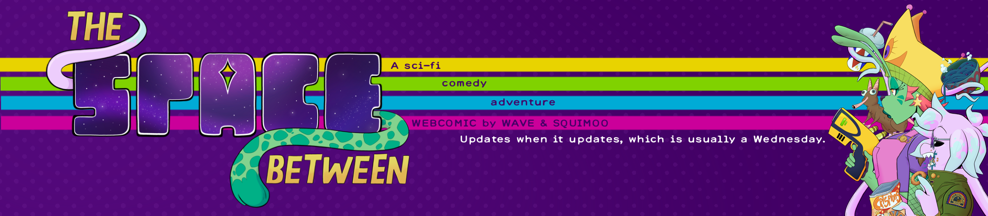
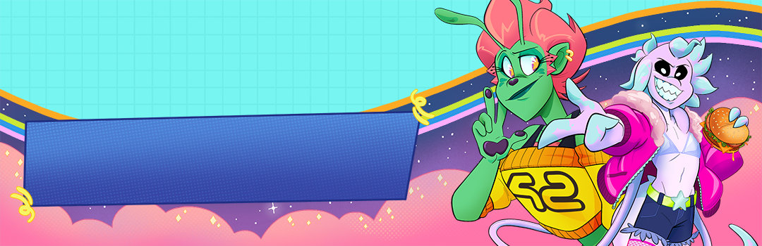
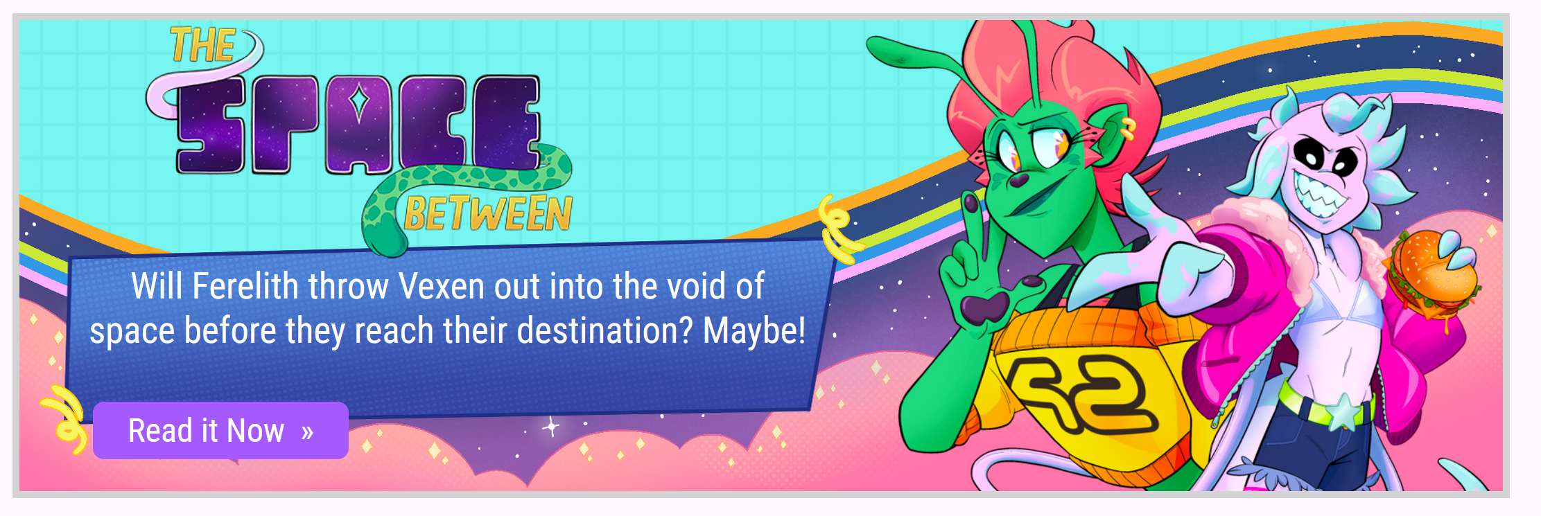
ANYWAY. Now for the actual reason of the blog post. Wave and I needed to create some new assets that could be used for SpiderForest’s carousel banner, and to give myself a break from working on pages it’s what I decided to turn my attention to. Where I can I like to give behind the scenes look into my processes. Above you will see a variation of the banner that I’ve used on our social media. Below is the process of how I went about it:
For a little while now I’ve been wanting to create some new promotional material assets, partially because I didn’t realise that our logo when viewed small, such as on our index card on SpiderForest gets absolutely devoured by our branding purple. A rookie error you can say. I’d never needed to make small assets to promote our comic prior joining the collective, so the issue hadn’t come to light.
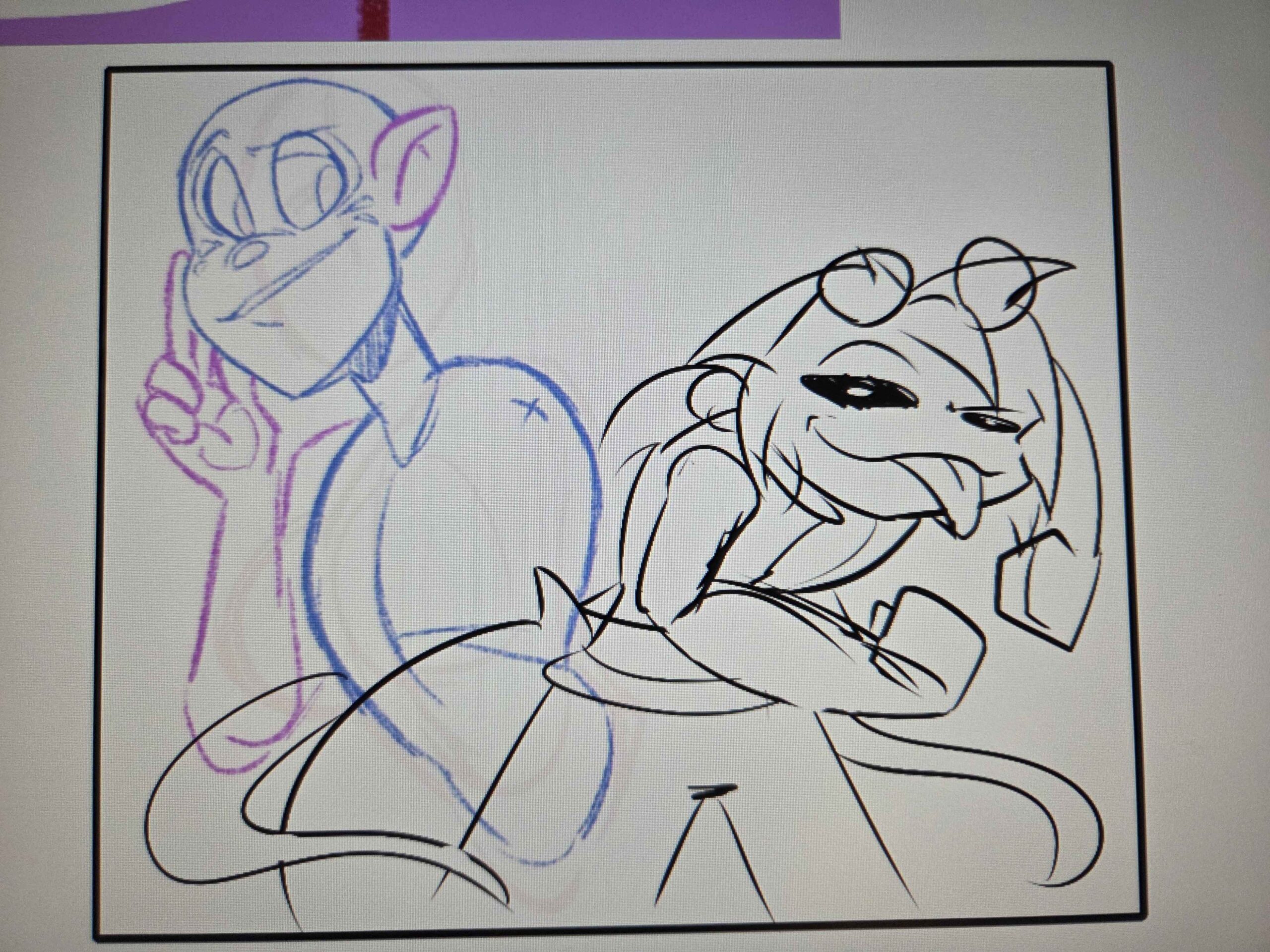
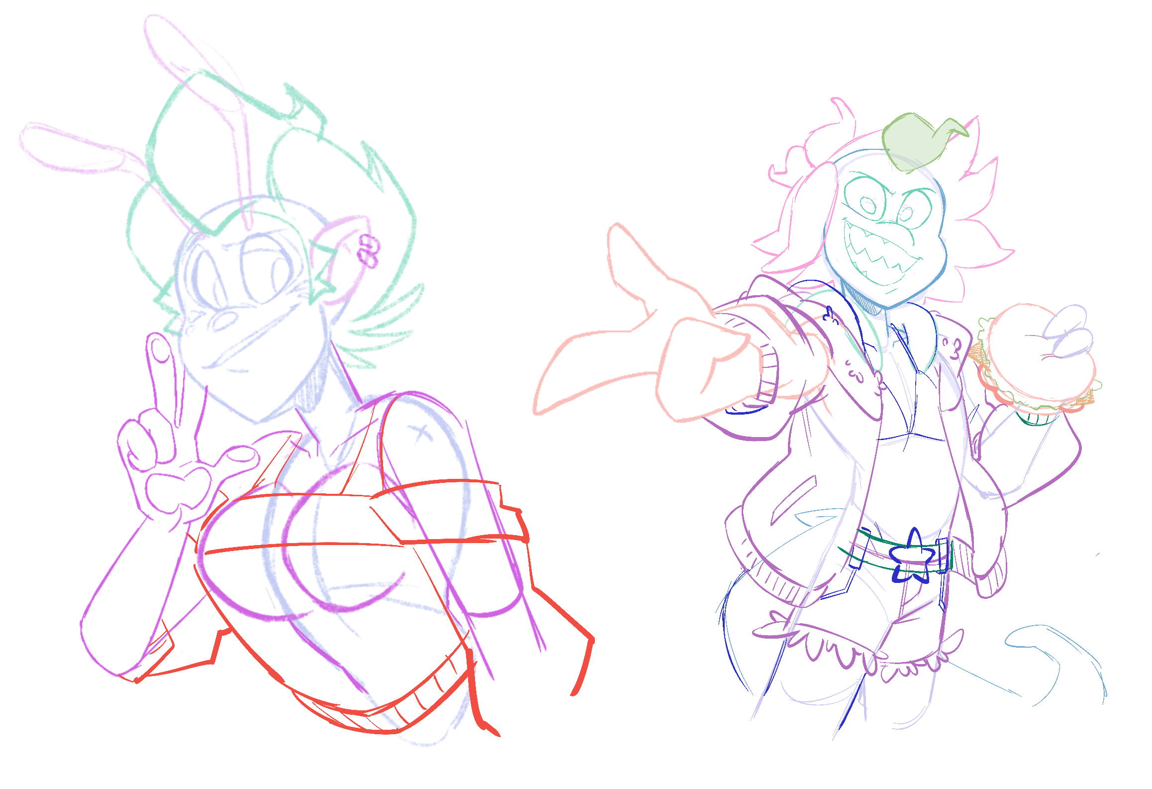
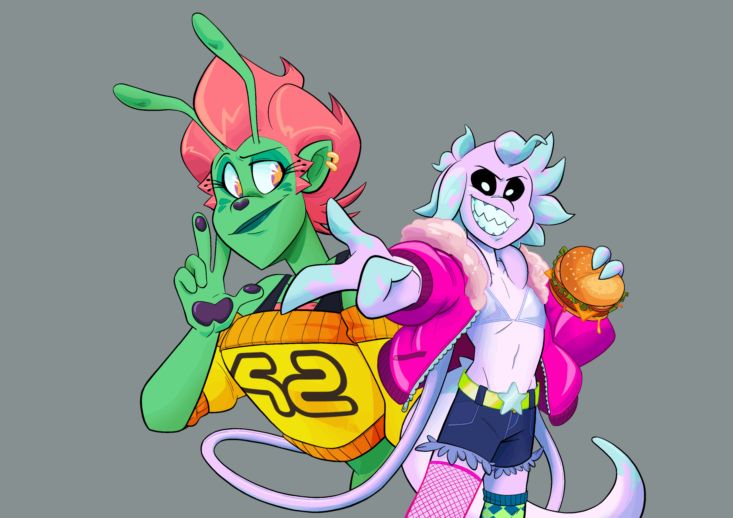
Coming up with promotional material is always a pain in the arse. It’s fun, sure! But you need to come up with something that looks appealing but also captures the vibe of your work in it’s entirety. For the composition of our two protagonist dorks – dorkagonists – I was bashing my head against a wall for a couple of days. Ferelith was the more corporative of the two, Vexen was not giving me a break as I had no idea how to pose them. Both Wave and Ty stepped in with their help and suggestions, as they often do.
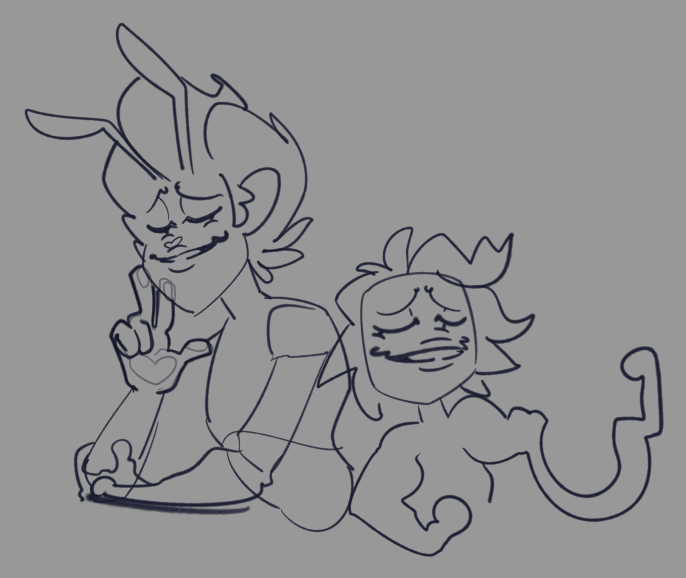
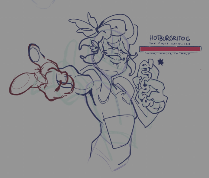
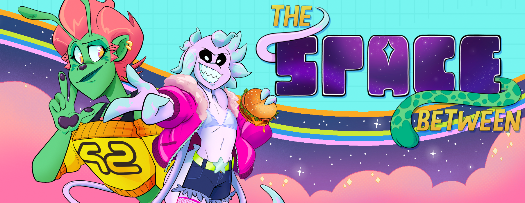
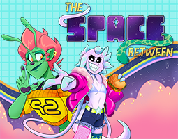
Eventually, I managed to get the character illustration complete, behold my beautiful children:
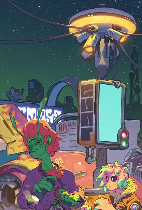
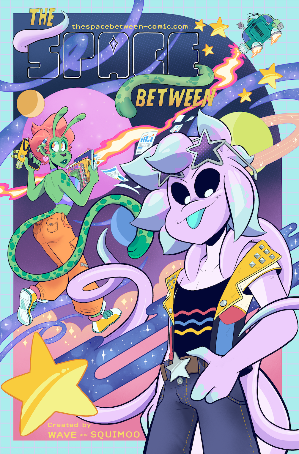
I had already an idea of what composition I wanted to do for the main banner, which was the one for the SpiderForest carousel. My next challenge was working our what colour scheme I wanted to do so our title graphic / logo would actually be noticeable. I needed to keep away from our typical branding design (no purple background) which completely stumped my brain. So, in a stroke of genius I went back to a very old illustration i did back in 2022 when The Space Between was still in it’s first chapter. I’d always wanted to go back and revisit / update this illustration, and I guess it’s new lease of life was to be repurposed into a banner 3 years on.
The SF-C (we’re calling it that now this far in) banner has the comic’s logo and tagline auto-generated, so using pre-existing banners as guide lines, predominantly of the webcomics Alethia and Damsel’s Don’t Wear Glasses, I was able to finalise the banner!
Also shout out and thank you to Darwin, creator of the webcomic Michael, who was able to to test-run my design into SpiderForest in advance.
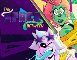
Along with this design I was also able to create a new index card that no longer eats the logo. Hooray!
And that’s a wrap, I’m please with the new illustration and the promotional assets I was able to get out of it with, as is often the case for me, help from a supportive team of folks.
Hopefully our next blog post will include the official announcement date of the start of Chapter 4: ILL WILL HUNTING. In the meantime, here’s a little preview I shared on our social media earlier this week of something special coming soon.
Peace & Love on planet Earth,
Squimoo x